Don't Copy From This Blog...

There are quite a few articles on the internet, and in print giving reasons for Apple's meteoric rise to success. Those articles are very long, and the writers of those articles use big words because they think it makes them look sophisticated and highbrow. It gives me a headache, and big words only makes it seem as if you're trying too hard. Put simply, the only reason why Apple rocketed to success is because they had a radically different design direction to their rivals.
Design here isn't used in an aesthetic sense. Before Apple, or Steve Jobs, everyone assumed users of technology were just as smart as the people who made them. Steve Jobs assumed the users of his products were morons, and designed them in such a way so that even the most technologically challenged person could use them. Jobs called his design direction intuition.
According to the dictionary,
intuition |ɪntjʊˈɪʃ(ə)n|noun [ mass noun ]the ability to understand something instinctively, without the need for conscious reasoning: we shallallow our intuition to guide us.• [ count noun ] a thing that one knows or considers likely from instinctive feeling rather than conscious reasoning: your insights and intuitions as a native speaker are positively sought.
Steve Jobs wasn't all that wrong in calling his customers morons. I don't think he ever said it verbally, but we all know that in the face of rapidly advancing technology, even the most tech savvy 5 year olds barely keep up. So there isn't a hope in hell that the average customer has any chance of using any new products. So he took the tech available, and buried it under an extremely simple interface so that it even users who are used to typewriters can easily use it. Till date I haven't seen a middle aged person take to a piece of modern technology as much as the iPad. The iPad is a masterstroke. Middle aged people who have lots of money love it because they can use it easily and keep up with the times, and because they have lots of money they don't mind Apple overcharging them. Another simple reason is that all Apple products simply work. It is a very attractive quality, and it's what makes German cars sell.
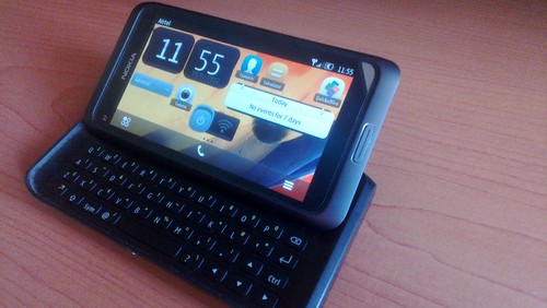
Apple designs products that simpletons can use easily. Nokia also perfected this design direction with its now ageing Symbian. Although they fell in a spot of trouble after Apple launched the iPhone due to what I suspect were a few fat cats scared of change. Now though, Nokia is back with Windows Phone 8, and they too are taking the right steps towards now what can now be called a 'successful design'. Samsung, however still doesn't quite understand the reason why Apple is so successful. It could do with the fact that they started off making mobile phones for the lower end of the market, where selling price of the phone was key, and everything else could, and was compromised on. It was, and is a successful strategy, and Samsung decided to adapt the same to the higher end of the market. At this end of the market however, selling price isn't key. Apple, and Nokia cottoned on this, and they soon became very successful. The only reason Samsung has a reasonably large market share is due to the only reason that will ensure its decline in the near future-its operating system, Google Android.
Google does a lot of things right. A list that includes it's search engine, translation, mapping and the ever entertaining Google Doodles. But they are horrible at making operating systems. The ChromeBook was a very shoddily put together weekend project that was aimed at a very specific market which was already taken over by the MacBook Air. Once you go Mac, you never go back? Thats the 11th commandment. It was a project which was doomed before it was ever conceptualised. Still Google hasn't given up, and now it has tried to take the fight to the MacBook Pro with what only be described as a jumped up ChromeBook with a touchscreen. It's hopeless. Its as if Google deliberately shot themselves in the knee, and then jumped off a cliff. I bet they're now simply hoping everyone forgets about the ChromeBook Pixel.
Android is another flawed design. Google nicked iOS in its infancy and then transformed it into Android as Larry Page was on Apple's board of directors. He quit and took the then young iOS into Google's hands. Steve Jobs was furious and he vowed to kill Android at any cost. Which is why Apple is suing Android whenever, and wherever. Nokia and Windows Phone 8 haven't attracted any attention. Android is an iOS clone gone horribly wrong. The design philosophy is stunted, and just like Windows 7, it was designed to be used by any number of manufacturers. So it is a compromised design, unlike Apple and Nokia, both of whom closely integrate their OS and hardware. Not only is a flawed design, but it is also technically inefficient, needing powerful processors to run anywhere near as smooth as iOS or WP8. Of course, many prefer Android because it's "open". There is a small percentage who use the open source OS for various project, but a majority of users use "open" as an excuse to get paid applications for free. In any case, Linux is a much better option, and it is much more versatile and powerful. No matter how many features Android might have, its just not going to match up to the user friendly interface of either iOS or WP8. The user friendly interface is a key point here. No matter how many more features are added to a device, the interface has to be able to maximise those features with minimal action.
iOS, and Mac OS X are classic examples of this design. Both have been constantly updated, but if a person who has been using the first version makes the jump to the latest version without having used any of the versions in between, the user would still feel at home, and would be able to use the device to its maximum potential. Microsoft too had followed a similar design direction, but then took a U-turn with Windows 8. This alienated many Windows 7 users, and forced them to revert back. It's not like Windows 8 is a huge leap forward either so the new UI which is supposed to work with touchscreen laptops and tablets is needlessly complicated. There is a reason why Apple didn't fit a touchscreen to the MacBook Air. There has rarely been a company like Apple which has managed to absolutely perfect their design direction and reap great rewards off it.
On a side note, a trend is emerging in design. The English are very good at this sort of thing. Apple, Formula 1, various fashion labels, all employ english designers. US, not so much. I might be wrong here, but it it something to do with education, or is it simply coincidence. Europe as a whole has better design sense than the US. Again, design isn't being referred to aesthetics, but the overall thinking behind any project.
Design here isn't used in an aesthetic sense. Before Apple, or Steve Jobs, everyone assumed users of technology were just as smart as the people who made them. Steve Jobs assumed the users of his products were morons, and designed them in such a way so that even the most technologically challenged person could use them. Jobs called his design direction intuition.
According to the dictionary,
intuition |ɪntjʊˈɪʃ(ə)n|noun [ mass noun ]the ability to understand something instinctively, without the need for conscious reasoning: we shallallow our intuition to guide us.• [ count noun ] a thing that one knows or considers likely from instinctive feeling rather than conscious reasoning: your insights and intuitions as a native speaker are positively sought.
Steve Jobs wasn't all that wrong in calling his customers morons. I don't think he ever said it verbally, but we all know that in the face of rapidly advancing technology, even the most tech savvy 5 year olds barely keep up. So there isn't a hope in hell that the average customer has any chance of using any new products. So he took the tech available, and buried it under an extremely simple interface so that it even users who are used to typewriters can easily use it. Till date I haven't seen a middle aged person take to a piece of modern technology as much as the iPad. The iPad is a masterstroke. Middle aged people who have lots of money love it because they can use it easily and keep up with the times, and because they have lots of money they don't mind Apple overcharging them. Another simple reason is that all Apple products simply work. It is a very attractive quality, and it's what makes German cars sell.
Apple designs products that simpletons can use easily. Nokia also perfected this design direction with its now ageing Symbian. Although they fell in a spot of trouble after Apple launched the iPhone due to what I suspect were a few fat cats scared of change. Now though, Nokia is back with Windows Phone 8, and they too are taking the right steps towards now what can now be called a 'successful design'. Samsung, however still doesn't quite understand the reason why Apple is so successful. It could do with the fact that they started off making mobile phones for the lower end of the market, where selling price of the phone was key, and everything else could, and was compromised on. It was, and is a successful strategy, and Samsung decided to adapt the same to the higher end of the market. At this end of the market however, selling price isn't key. Apple, and Nokia cottoned on this, and they soon became very successful. The only reason Samsung has a reasonably large market share is due to the only reason that will ensure its decline in the near future-its operating system, Google Android.
Google does a lot of things right. A list that includes it's search engine, translation, mapping and the ever entertaining Google Doodles. But they are horrible at making operating systems. The ChromeBook was a very shoddily put together weekend project that was aimed at a very specific market which was already taken over by the MacBook Air. Once you go Mac, you never go back? Thats the 11th commandment. It was a project which was doomed before it was ever conceptualised. Still Google hasn't given up, and now it has tried to take the fight to the MacBook Pro with what only be described as a jumped up ChromeBook with a touchscreen. It's hopeless. Its as if Google deliberately shot themselves in the knee, and then jumped off a cliff. I bet they're now simply hoping everyone forgets about the ChromeBook Pixel.
Android is another flawed design. Google nicked iOS in its infancy and then transformed it into Android as Larry Page was on Apple's board of directors. He quit and took the then young iOS into Google's hands. Steve Jobs was furious and he vowed to kill Android at any cost. Which is why Apple is suing Android whenever, and wherever. Nokia and Windows Phone 8 haven't attracted any attention. Android is an iOS clone gone horribly wrong. The design philosophy is stunted, and just like Windows 7, it was designed to be used by any number of manufacturers. So it is a compromised design, unlike Apple and Nokia, both of whom closely integrate their OS and hardware. Not only is a flawed design, but it is also technically inefficient, needing powerful processors to run anywhere near as smooth as iOS or WP8. Of course, many prefer Android because it's "open". There is a small percentage who use the open source OS for various project, but a majority of users use "open" as an excuse to get paid applications for free. In any case, Linux is a much better option, and it is much more versatile and powerful. No matter how many features Android might have, its just not going to match up to the user friendly interface of either iOS or WP8. The user friendly interface is a key point here. No matter how many more features are added to a device, the interface has to be able to maximise those features with minimal action.
iOS, and Mac OS X are classic examples of this design. Both have been constantly updated, but if a person who has been using the first version makes the jump to the latest version without having used any of the versions in between, the user would still feel at home, and would be able to use the device to its maximum potential. Microsoft too had followed a similar design direction, but then took a U-turn with Windows 8. This alienated many Windows 7 users, and forced them to revert back. It's not like Windows 8 is a huge leap forward either so the new UI which is supposed to work with touchscreen laptops and tablets is needlessly complicated. There is a reason why Apple didn't fit a touchscreen to the MacBook Air. There has rarely been a company like Apple which has managed to absolutely perfect their design direction and reap great rewards off it.
On a side note, a trend is emerging in design. The English are very good at this sort of thing. Apple, Formula 1, various fashion labels, all employ english designers. US, not so much. I might be wrong here, but it it something to do with education, or is it simply coincidence. Europe as a whole has better design sense than the US. Again, design isn't being referred to aesthetics, but the overall thinking behind any project.